Plotting With Python
Create line and scatter plots for quantitative data.
Learning Objectives
- Plot a sequence of values.
- Plot paired x/y values.
- Interpret axes, markers, and trends.
- Use reusable plotting helpers from
FreeCampus Math.
Motivation
Graphs help us see patterns that are hard to notice in tables: growth, variation, outliers, and relationships between variables.
Line Plots
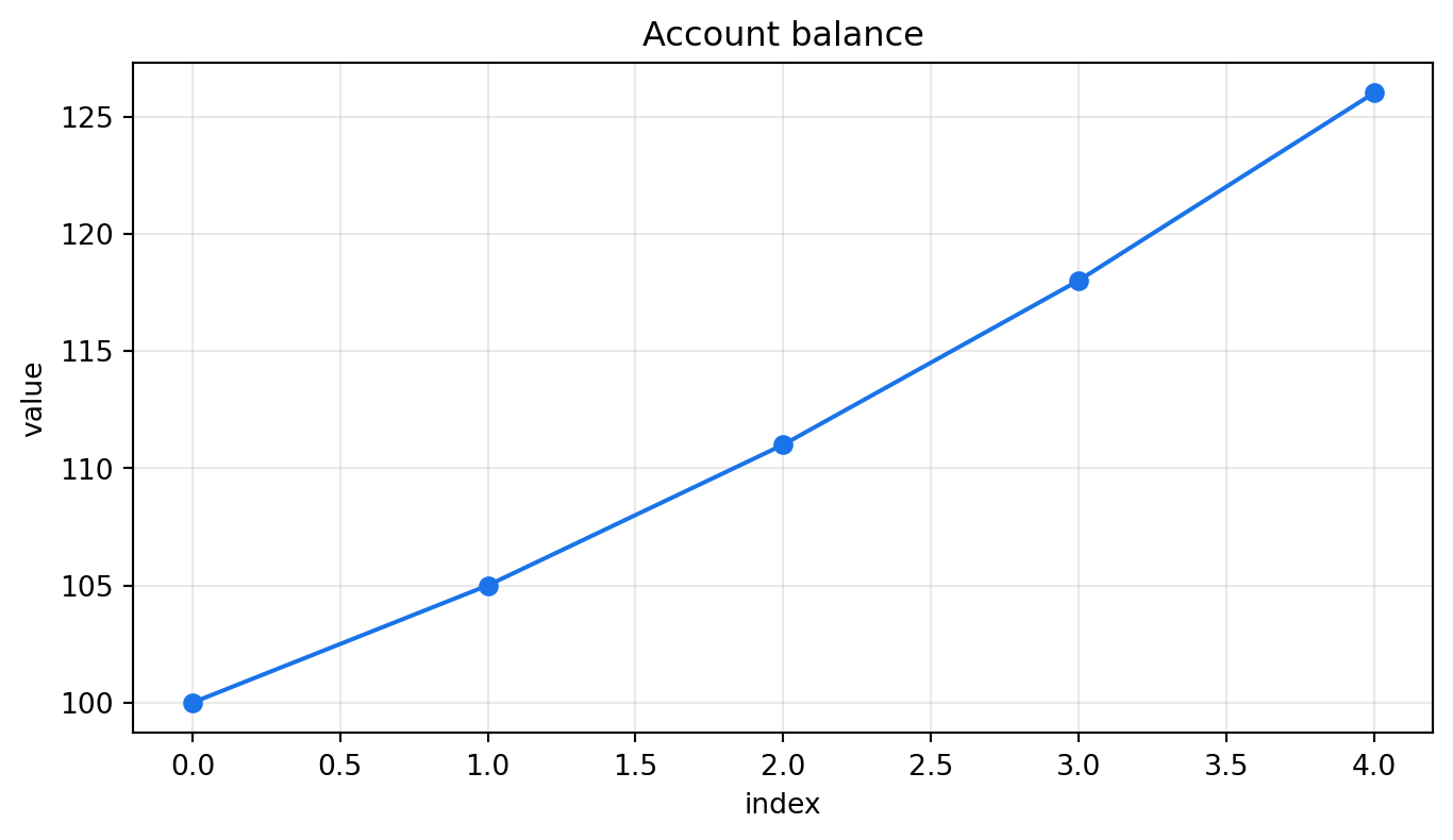
A line plot is useful when values have a natural order, such as time.
Scatter Plots
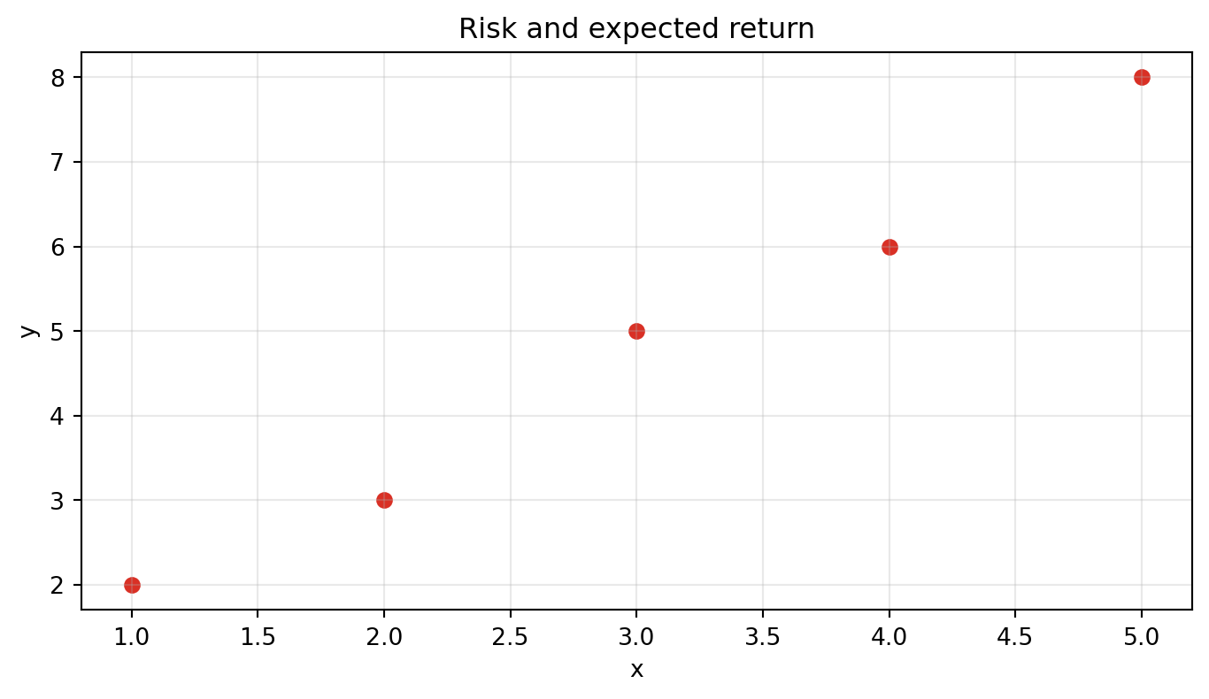
A scatter plot is useful for paired data.
Reading a Plot
Ask three questions:
- What does the x-axis represent?
- What does the y-axis represent?
- What pattern do the points or line show?
Common Mistakes
Plotting Without Labels
Unlabeled axes make the graph hard to interpret. Always know what each axis means.
Assuming Correlation Means Causation
A scatter plot can show association, but it does not prove that one variable causes another.
Practice
- Plot
[1, 4, 9, 16]as a line chart. - Create a scatter plot for
x = [1, 2, 3]andy = [3, 2, 5]. - Add a title that explains what the plot shows.
- Explain the pattern in one sentence.
Solutions
TipSolution 1
Answer:
from fcmath.python_fundamentals import plot_values

fig, ax = plot_values([1, 4, 9, 16], title="Square numbers")
TipSolution 2
Answer:
import matplotlib.pyplot as plt

fig, ax = plt.subplots()
ax.scatter([1, 2, 3], [3, 2, 5])
TipSolution 3
Answer:
ax.set_title("Observed values by input")
TipSolution 4
Answer: the values decrease from x = 1 to x = 2, then increase sharply at x = 3.