from edumath.python_fundamentals import plot_values

balances = [100, 105, 111, 118, 126]
fig, ax = plot_values(balances, title="Account balance")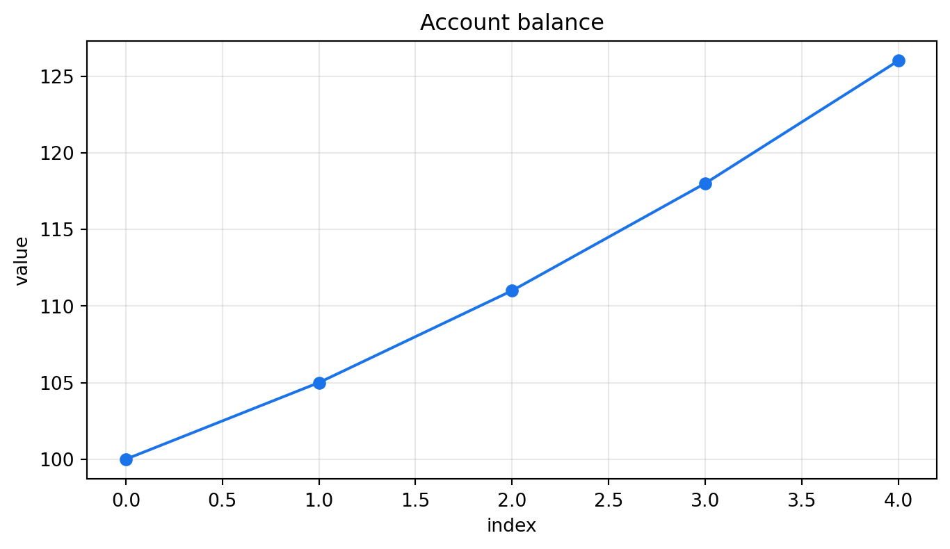
edu-math.Graphs help us see patterns that are hard to notice in tables: growth, variation, outliers, and relationships between variables.
A line plot is useful when values have a natural order, such as time.
from edumath.python_fundamentals import plot_values
balances = [100, 105, 111, 118, 126]
fig, ax = plot_values(balances, title="Account balance")
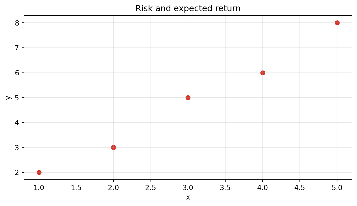
A scatter plot is useful for paired data.
from edumath.python_fundamentals import scatter_values

risk = [1, 2, 3, 4, 5]
expected_return = [2, 3, 5, 6, 8]

fig, ax = scatter_values(
    risk,
    expected_return,
    title="Risk and expected return",
)
Ask three questions:
Unlabeled axes make the graph hard to interpret. Always know what each axis means.
A scatter plot can show association, but it does not prove that one variable causes another.
[1, 4, 9, 16] as a line chart.x = [1, 2, 3] and y = [3, 2, 5].Answer:
from edumath.python_fundamentals import plot_values

fig, ax = plot_values([1, 4, 9, 16], title="Square numbers")Answer:
import matplotlib.pyplot as plt

fig, ax = plt.subplots()
ax.scatter([1, 2, 3], [3, 2, 5])Answer:
ax.set_title("Observed values by input")Answer: the values decrease from x = 1 to x = 2, then increase sharply at x = 3.